Creating area charts
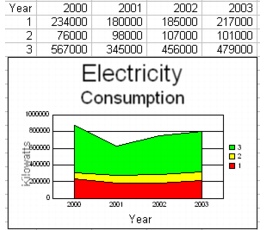
You can use area charts to illustrate the amount of change over time. For example, you can use an area chart to show the change in electricity consumption rates over a number of years. Area charts are similar to line charts, but the area beneath the line is shaded. Columns of data are stacked on top one another, with a different shading color assigned to each column.
Area charts (except 2D and 3D, unstacked area charts) plot cumulative rather than individual values. The first series is plotted without modification. The second series is plotted with the top of the first series used as the baseline. The third series is charted on top of the second, and so forth.

You can choose from several area chart options, which you can use in combination with other chart options. Stacked area charts display the data in each column as a combined total, with data stacked from bottom to top; 100% stacked area charts display the data in each column as a percentage of the whole column. Horizontal area charts display the chart horizontally instead of vertically. Bipolar area charts split the chart data and plot it along two y-axes.
For information about editing charts, see “Editing charts.”
To create an area chart |
|
1.
|
|
Select the cells you want to plot.
|
|
If the surrounding cells contain explanatory labels, you can include them in the selection for use as the chart axis labels or the chart legend.
|
|
2.
|
|
Click Insert
|
|
3.
|
|
Click Next.
|
|
4.
|
|
Choose Area from the Category list.
|
|
5.
|
|
Click one of the following area chart options on the Type palette:
|
|
•
|
2D stacked area
|
|
•
|
2D 100% stacked area
|
|
•
|
2D horizontal stacked area
|
|
•
|
2D 100% horizontal stacked area
|
|
•
|
2D unstacked area
|
|
•
|
2D horizontal unstacked area
|
|
•
|
2D bipolar stacked area
|
|
•
|
2D horizontal bipolar stacked area
|
|
•
|
2D horizontal bipolar unstacked area
|
|
6.
|
|
Click Next.
|
|
7.
|
|
Type in any of the following boxes:
|
|
•
|
Title
|
|
•
|
Subtitle
|
|
•
|
X-axis
|
|
•
|
Y-axis
|
|
•
|
Footnote
|
|
8.
|
|
Click Next.
|
|
9.
|
|
Choose a color scheme option from the Choose a color scheme list.
|
|
10.
|
|
Click Finish.
|
|
11.
|
|
Drag in the spreadsheet.
|
![]()
|
•
|
|
You can add a secondary y-axis by enabling the Add secondary y-axis check box.
|
|
•
|
|
You can add depth to a chart by enabling the Add depth check box. You can also apply advanced rendering to a chart by enabling the Advanced rendering check box.
|
To create a 3D area chart |
|
1.
|
|
Select the cells you want to plot.
|
|
If the surrounding cells contain explanatory labels, you can include them in the selection for use as the chart axis labels or the chart legend.
|
|
2.
|
|
Click Insert
|
|
3.
|
|
Click Next.
|
|
4.
|
|
Choose Area from the Category list.
|
|
5.
|
|
Enable the 3D check box.
|
|
6.
|
|
Click one of the following area chart options on the Type palette:
|
|
•
|
3D unstacked row area
|
|
•
|
3D unstacked column area
|
|
7.
|
|
Click Next.
|
|
8.
|
|
Type in any of the following boxes:
|
|
•
|
Title
|
|
•
|
Subtitle
|
|
•
|
X-axis
|
|
•
|
Y-axis
|
|
•
|
Z-axis
|
|
•
|
Footnote
|
|
9.
|
|
Click Next.
|
|
10.
|
|
Choose a color scheme option from the Choose a color scheme list.
|
|
11.
|
|
Click Finish.
|
|
12.
|
|
Drag in the spreadsheet.
|