Creating bar charts
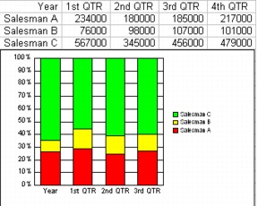
You can use bar charts to illustrate individual values or to make simple comparisons of different values at a specific time. For example, you can use a bar chart to illustrate how much three salespeople sold over four quarters.
Bar charts display each value in a series as a bar. Values are plotted against the y-axis scale — the taller the bar, the greater the value. Bar charts are ideal for comparison or ranking of items against one scale.
Quattro Pro lets you create stacked bar charts and bipolar bar charts. Stacked bar charts show the relationship of each value to the total, for example, how total sales are divided between regions. Bipolar bar charts split the chart data and plot it along two y-axes. In 100% stacked bar charts, the data appears in each column as a percentage of the whole column. Horizontal bar charts display the chart horizontally instead of vertically.

For information about modifying bar charts, see “Changing bar chart options.” For information about editing charts, see “Editing charts.”
To create a bar chart |
|
1.
|
|
Select the cells you want to plot.
|
|
If the surrounding cells contain explanatory labels, you can include them in the selection for use as the chart axis labels or the chart legend.
|
|
2.
|
|
Insert
|
|
3.
|
|
Click Next.
|
|
4.
|
|
Choose Bar from the Category list.
|
|
5.
|
|
Click one of the following area chart options on the Type palette:
|
|
•
|
2D bar
|
|
•
|
2D horizontal bar
|
|
•
|
2D stacked bar
|
|
•
|
2D horizontal stacked bar
|
|
•
|
2D 100% stacked bar
|
|
•
|
2D 100% horizontal stacked bar
|
|
•
|
2D bipolar stacked bar
|
|
•
|
2D bipolar horizontal stacked bar
|
|
•
|
2D bipolar bar
|
|
•
|
2D horizontal bipolar bar
|
|
6.
|
|
Click Next.
|
|
7.
|
|
Type in any of the following boxes:
|
|
•
|
Title
|
|
•
|
Subtitle
|
|
•
|
X-axis
|
|
•
|
Y-axis
|
|
•
|
Footnote
|
|
8.
|
|
Click Next.
|
|
9.
|
|
Choose a color scheme option from the Choose a color scheme list.
|
|
10.
|
|
Click Finish.
|
|
11.
|
|
Drag in the spreadsheet.
|
![]()
|
•
|
|
You can add a secondary y-axis by enabling the Add secondary y-axis check box.
|
|
•
|
|
You can add depth to a chart by enabling the Add depth check box. You can also apply advanced rendering to a chart by enabling the Advanced rendering check box.
|
To create a 3D bar chart |
|
1.
|
|
Select the cells you want to plot.
|
|
If the surrounding cells contain explanatory labels, you can include them in the selection for use as the chart axis labels or the chart legend.
|
|
2.
|
|
Insert
|
|
3.
|
|
Click Next.
|
|
4.
|
|
Choose Bar from the Category list.
|
|
5.
|
|
Enable the 3D check box.
|
|
6.
|
|
Click one of the following area chart options on the Type palette:
|
|
•
|
3D bar
|
|
•
|
3D cut corners bar
|
|
•
|
3D octagon bar
|
|
•
|
3D pyramid bar
|
|
•
|
3D diamond bar
|
|
7.
|
|
Click Next.
|
|
8.
|
|
Type in any of the following boxes:
|
|
•
|
Title
|
|
•
|
Subtitle
|
|
•
|
X-axis
|
|
•
|
Y-axis
|
|
•
|
Z-axis
|
|
•
|
Footnote
|
|
9.
|
|
Click Next.
|
|
10.
|
|
Choose a color scheme option from the Choose a color scheme list.
|
|
11.
|
|
Click Finish.
|
|
12.
|
|
Drag in the spreadsheet.
|