Creating bubble charts
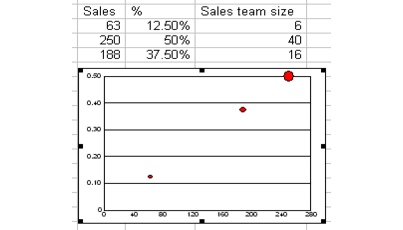
You can use bubble charts to present financial data. You must have three sets of data to create a bubble chart. Bubble charts plot data against two axes. The position of the bubble illustrates two sets of data, and the size of the bubble illustrates a third set of data. For example, you can use a bubble chart to compare the performance of sales teams based on the follow data: sales (in a currency format), the percentage of total sales, and the number of salespeople on that team.
Bubble charts are similar to scatter charts; however, in a bubble chart, a third value is represented by the size of the bubble.

The size of the bubble is relative to the size of the sales team.
For information about modifying bubble charts, see “Changing chart data.” For information about modifying charts, see “Working with chart series.” For information about editing charts, see “Editing charts.”
To create a bubble chart |
|
1.
|
|
Select the cells you want to plot.
|
|
If the surrounding cells contain explanatory labels, you can include them in the selection for use as the chart axis labels or the chart legend.
|
|
2.
|
|
Click Insert
|
|
3.
|
|
Click Next.
|
|
4.
|
|
Choose Bubble from the Category list.
|
|
5.
|
|
Click Next.
|
|
6.
|
|
Type in any of the following boxes:
|
|
•
|
Title
|
|
•
|
Subtitle
|
|
•
|
X-axis
|
|
•
|
Y-axis
|
|
•
|
Footnote
|
|
7.
|
|
Click Next.
|
|
8.
|
|
Choose a color scheme option from the Choose a color scheme list.
|
|
9.
|
|
Click Finish.
|
|
10.
|
|
Drag in the spreadsheet.
|
![]()
|
•
|
|
You can add a secondary y-axis by enabling the Add secondary y-axis check box.
|
|
•
|
|
You can add depth to a chart by enabling the Add depth check box. You can also apply advanced rendering to a chart by enabling the Advanced rendering check box.
|