Creating high/low charts
You can use high/low (open/close) charts to track daily stock prices. You need at least two series of data to create this type of chart (to represent the highest and lowest stock prices reached each day).
The type of high/low chart that you can create depends on the number of data series that you want to plot.
A common use for the fifth series is to display the volume data, or number of shares of stock that changed hands on a given that day. Volume data is usually much larger than high/low data, so the high/low data does not show up well in the chart. The high/low bar chart has special formatting to correct this problem. The first four series are plotted as they would be in regular high/low charts. The fifth series, however, is plotted as bars against the secondary y-axis. The secondary y-axis scale is adjusted to plot the bars on the lower quarter of the chart, where the bars are unlikely to cover the high/low values.

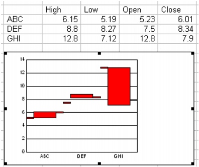
A high/low/open/close chart. The tick marks show the stock’s highesr and lowest prices.
For information about modifying high/low charts, see “Changing high/low chart options” and “To change the data range of a series in a high\low chart.” For information about editing charts, see “Editing charts.”
To create a high/low chart |
|
1.
|
|
Select the cells you want to plot.
|
|
If the surrounding cells contain explanatory labels, you can include them in the selection for use as the chart axis labels or the chart legend.
|
|
2.
|
|
Insert
|
|
3.
|
|
Click Next.
|
|
4.
|
|
Choose High low from the Category list.
|
|
5.
|
|
Click one of the following area chart options on the Type palette:
|
|
•
|
High low
|
|
•
|
High low open
|
|
•
|
High low close
|
|
•
|
High low open close
 images/chart_high_low_open_close.jpg" height="16" width="16" border="0" hspace="0" vspace="0">
 |
|
•
|
High low open close volume
|
|
6.
|
|
Click Next.
|
|
7.
|
|
Type in any of the following boxes:
|
|
•
|
Title
|
|
•
|
Subtitle
|
|
•
|
X-axis
|
|
•
|
Y-axis
|
|
•
|
Footnote
|
|
8.
|
|
Click Next.
|
|
9.
|
|
Choose a color scheme option from the Choose a color scheme list.
|
|
10.
|
|
Click Finish.
|
|
11.
|
|
Drag in the spreadsheet.
|
![]()
|
•
|
|
You can add depth to a chart by enabling the Add depth check box. You can also apply advanced rendering to a chart by enabling the Advanced rendering check box.
|