Creating line charts
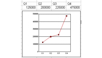
You can use line charts to illustrate trends over a period of time. Line charts plot series values as points, and connect the points in each series with a line.
You can create 2D and 3D line charts. You can choose from several line chart options. Stacked line charts display the data in each column as a combined total, stacked from bottom to top. In 100% stacked line charts, the data in each column is displayed as a percentage of the whole column. Horizontal line charts display the chart horizontally instead of vertically. Bipolar line charts split the chart data and plot it along two y-axes.

For information about modifying line charts, see “Changing line chart options.” For information about editing charts, see “Editing charts.”
To create a line chart |
|
1.
|
|
Select the cells you want to plot.
|
|
If the surrounding cells contain explanatory labels, you can include them in the selection for use as the chart axis labels or the chart legend.
|
|
2.
|
|
Click Insert
|
|
3.
|
|
Click Next.
|
|
4.
|
|
Choose Line from the Category list.
|
|
5.
|
|
Click one of the following area chart options on the Type palette:
|
|
•
|
2D line
|
|
•
|
2D horizontal line
|
|
•
|
2D bipolar line
|
|
•
|
2D horizontal bipolar line
|
|
•
|
2D stacked line
|
|
•
|
2D 100% stacked
|
|
•
|
2D horizontal stacked line
|
|
•
|
2D horizontal 100% stacked line
|
|
•
|
2D stacked bipolar line
|
|
•
|
2D horizontal stacked bipolar line
|
|
6.
|
|
Click Next.
|
|
7.
|
|
Type in any of the following boxes:
|
|
•
|
Title
|
|
•
|
Subtitle
|
|
•
|
X-axis
|
|
•
|
Y-axis
|
|
•
|
Footnote
|
|
8.
|
|
Click Next.
|
|
9.
|
|
Choose a color scheme option from the Choose a color scheme list.
|
|
10.
|
|
Click Finish.
|
|
11.
|
|
Drag in the spreadsheet.
|
![]()
|
•
|
|
You can add depth to a chart by enabling the Add depth check box. You can also apply advanced rendering to a chart by enabling the Advanced rendering check box.
|
To create a 3D line chart |
|
1.
|
|
Select the cells you want to plot.
|
|
If the surrounding cells contain explanatory labels, you can include them in the selection for use as the chart axis labels or the chart legend.
|
|
2.
|
|
Click Insert
|
|
3.
|
|
Click Next.
|
|
4.
|
|
Choose Line from the Category list.
|
|
5.
|
|
Enable the 3D check box.
|
|
6.
|
|
Click one of the following area chart options on the Type palette:
|
|
•
|
3D line
|
|
•
|
3D column line
|
|
•
|
3D step
|
|
•
|
3D column step
|
|
•
|
3D floating cubes
|
|
•
|
3D floating diamonds
|
|
•
|
3D floating squares
|
|
7.
|
|
Click Next.
|
|
8.
|
|
Type in any of the following boxes:
|
|
•
|
Title
|
|
•
|
Subtitle
|
|
•
|
X-axis
|
|
•
|
Y-axis
|
|
•
|
Z-axis
|
|
•
|
Footnote
|
|
9.
|
|
Click Next.
|
|
10.
|
|
Choose a color scheme option from the Choose a color scheme list.
|
|
11.
|
|
Click Finish.
|
|
12.
|
|
Drag in the spreadsheet.
|