Creating mixed charts
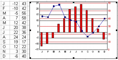
You can combine two chart types in one chart to present two different sets of information at the same time. Mixed charts combine bars, lines, and areas in the same chart to highlight a series, or to contrast different series, in the chart. For example, you can use a mixed chart to illustrate average daily temperature (using a bar chart) and precipitation (line chart).

A 2D line-bar chart using a secondary y-axis. The bar chart uses the left y-axis; the line chart uses the right y-axis.
Quattro Pro provides three combination charts: area-line, area-bar, and line-bar. Line-bar charts and area-bar charts plot the first series as a bar, and they plot all other series as lines or areas.
For information about modifying charts, see “Working with chart series.” For information about editing charts, see “Editing charts.”
To create a mixed chart |
|
1.
|
|
Select the cells you want to plot.
|
|
If the surrounding cells contain explanatory labels, you can include them in the selection for use as the chart axis labels or the chart legend.
|
|
2.
|
|
Click Insert
|
|
3.
|
|
Click Next.
|
|
4.
|
|
Choose Mixed from the Category list.
|
|
5.
|
|
Click one of the following area chart options on the Type palette:
|
|
•
|
2D area-line
|
|
•
|
2D area-bar
|
|
•
|
2D line-bar
|
|
6.
|
|
Click Next.
|
|
7.
|
|
Type in any of the following boxes:
|
|
•
|
Title
|
|
•
|
Subtitle
|
|
•
|
X-axis
|
|
•
|
Y-axis
|
|
•
|
Footnote
|
|
8.
|
|
Click Next.
|
|
9.
|
|
Choose a color scheme option from the Choose a color scheme list.
|
|
10.
|
|
Click Finish.
|
|
11.
|
|
Drag in the spreadsheet.
|
![]()
|
•
|
|
You can apply advanced rendering to a chart by enabling the Advanced rendering check box.
|