Creating pie charts
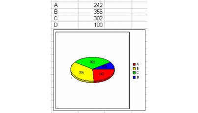
You can use pie charts to show comparisons within a data series, and to show how a data point contributes to a data series. For example, you can use a pie chart to show how different sales teams contributed to a company’s total sales. It’s best to limit pie charts to data series with six or fewer data points. The fewer data points the pie chart contains, the more effective it is in illustrating the relationship of each slice to the whole.

You can create 2D and 3D charts, as well as doughnut and column charts, which are variations of the original pie chart.
You can also create a pie chart in which one slice is expanded into a separate pie chart that displays its own detailed components.
For information about modifying pie charts, see “Changing pie chart options.” For information about editing charts, see “Editing charts.”
To create a pie chart |
|
1.
|
|
Select the cells you want to plot.
|
|
If the surrounding cells contain explanatory labels, you can include them in the selection for use as the chart axis labels or the chart legend.
|
|
2.
|
|
Click Insert
|
|
3.
|
|
Click Next.
|
|
4.
|
|
Choose Pie from the Category list.
|
|
5.
|
|
Click one of the following area chart options on the Type palette:
|
|
•
|
Pie
|
|
•
|
Doughnut
|
|
•
|
Pie of a pie
|
|
•
|
Column of a pie
|
|
•
|
Column of a doughnut
|
|
•
|
Multiple pie
|
|
•
|
Multiple doughnut
|
|
•
|
Multiple pie proportional
|
|
•
|
Multiple doughnut proportional
|
|
6.
|
|
Click Next.
|
|
7.
|
|
Type in any of the following boxes:
|
|
•
|
Title
|
|
•
|
Subtitle
|
|
•
|
X-axis
|
|
•
|
Y-axis
|
|
•
|
Footnote
|
|
8.
|
|
Click Next.
|
|
9.
|
|
Choose a color scheme option from the Choose a color scheme list.
|
|
10.
|
|
Click Finish.
|
|
11.
|
|
Drag in the spreadsheet.
|
![]()
|
•
|
|
You can add depth to a chart by enabling the Add depth check box. You can also apply advanced rendering to a chart by enabling the Advanced rendering check box.
|
To create a 3D pie chart |
|
1.
|
|
Select the cells you want to plot.
|
|
If the surrounding cells contain explanatory labels, you can include them in the selection for use as the chart axis labels or the chart legend.
|
|
2.
|
|
Click Insert
|
|
3.
|
|
Click Next.
|
|
4.
|
|
Choose Pie from the Category list.
|
|
5.
|
|
Enable the 3D check box.
|
|
6.
|
|
Click one of the following area chart options on the Type palette:
|
|
•
|
3D pie
|
|
•
|
3D doughnut
|
|
•
|
3D multiple pie
|
|
•
|
3D multiple pie proportional
|
|
•
|
3D multiple doughnut
|
|
•
|
3D multiple doughnut proportional
|
|
7.
|
|
Click Next.
|
|
8.
|
|
Type in any of the following boxes:
|
|
•
|
Title
|
|
•
|
Subtitle
|
|
•
|
X-axis
|
|
•
|
Y-axis
|
|
•
|
Footnote
|
|
9.
|
|
Click Next.
|
|
10.
|
|
Choose a color scheme option from the Choose a color scheme list.
|
|
11.
|
|
Click Finish.
|
|
12.
|
|
Drag in the spreadsheet.
|