Creating scatter charts
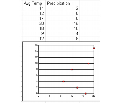
You can use scatter charts to display group data effectively. For example, you can use scatter charts to display daily average temperatures and daily precipitation.

Scatter charts have x-axis series that contain numeric data instead of text labels. The y-axis scale is calculated from the data in the series. Each series value is plotted as a pair of coordinates. The first coordinate is an x-axis series value; it determines where the data point is placed relative to the x-axis. The second coordinate is the corresponding value in the series you are plotting; it gives the data point’s position relative to the y-axis.
Quattro Pro provides two different types of scatter charts: XY and XYX. The difference between XY and XYX charts is how they interpret data from the spreadsheet. If the chart is plotted by columns, the first column in an XY chart becomes the x-coordinate, and the rest of the columns become the y-coordinates. In an XYX chart, the first column becomes the x-coordinate, the second column becomes the y-coordinate, the third column becomes a different x-coordinate, and the fourth column becomes a different y-coordinate.
For information about modifying XYX and XY scatter charts, see “Changing chart data.” For information about modifying charts, see “Working with chart series.” For information about editing charts, see “Editing charts.”
To create a scatter chart |
|
1.
|
|
Select the cells you want to plot.
|
|
If the surrounding cells contain explanatory labels, you can include them in the selection for use as the chart axis labels or the chart legend.
|
|
2.
|
|
Click Insert
|
|
3.
|
|
Click Next.
|
|
4.
|
|
Choose Scatter from the Category list.
|
|
5.
|
|
Click one of the following area chart options on the Type palette:
|
|
•
|
XYX scatter with line
|
|
•
|
XYX scatter no line
|
|
•
|
Horizontal XYX scatter with line
|
|
•
|
Horizontal XYX scatter no line
|
|
•
|
XY scatter with line
|
|
•
|
XY scatter no line
|
|
•
|
Horizontal XY scatter with line
|
|
•
|
Horizontal XY scatter no line
|
|
6.
|
|
Click Next.
|
|
7.
|
|
Type in any of the following boxes:
|
|
•
|
Title
|
|
•
|
Subtitle
|
|
•
|
X-axis
|
|
•
|
Y-axis
|
|
•
|
Footnote
|
|
8.
|
|
Click Next.
|
|
9.
|
|
Choose a color scheme option from the Choose a color scheme list.
|
|
10.
|
|
Click Finish.
|
|
11.
|
|
Drag in the spreadsheet.
|
![]()
|
•
|
|
You can add depth to a chart by enabling the Add depth check box. You can also apply advanced rendering to a chart by enabling the Advanced rendering check box.
|
To create a 3D scatter chart |
|
1.
|
|
Select the cells you want to plot.
|
|
To create a 3D scatter chart, you must select at least three data series.
|
|
If the surrounding cells contain explanatory labels, you can include them in the selection for use as the chart axis labels or the chart legend.
|
|
2.
|
|
Click Insert
|
|
3.
|
|
Click Next.
|
|
4.
|
|
Choose Scatter from the Category list.
|
|
5.
|
|
Enable the 3D check box.
|
|
6.
|
|
Click Next.
|
|
7.
|
|
Type in any of the following boxes:
|
|
•
|
Title
|
|
•
|
Subtitle
|
|
•
|
X-axis
|
|
•
|
Y-axis
|
|
•
|
Z-axis
|
|
•
|
Footnote
|
|
8.
|
&
nbsp; |
Click Next.
|
|
9.
|
|
Choose a color scheme option from the Choose a color scheme list.
|
|
10.
|
|
Click Finish.
|
|
11.
|
|
Drag in the spreadsheet.
|