Creating spectral charts
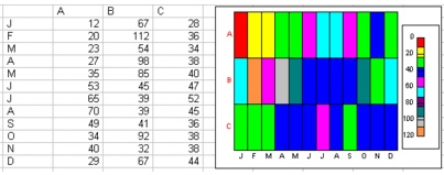
You can use spectral charts to illustrate relationships between data points that might be hard to see otherwise. Spectral charts use colors to show ranges of values, so that high and low points are easily identifiable. For example, a company that sells three products can use a spectral chart to obtain a month-by-month picture of sales.

For information about modifying charts, see “Working with chart series.” For information about editing charts, see “Editing charts.”
To create a spectral chart |
|
1.
|
|
Select the cells you want to plot.
|
|
If the surrounding cells contain explanatory labels, you can include them in the selection for use as the chart axis labels or the chart legend.
|
|
2.
|
|
Click Insert
|
|
3.
|
|
Click Next.
|
|
4.
|
|
Choose Spectral from the Category list.
|
|
5.
|
|
Click Next.
|
|
6.
|
|
Type in any of the following boxes:
|
|
•
|
Title
|
|
•
|
Subtitle
|
|
•
|
X-axis
|
|
•
|
Y-axis
|
|
•
|
Footnote
|
|
7.
|
|
Click Next.
|
|
8.
|
|
Choose a color scheme option from the Choose a color scheme list.
|
|
9.
|
|
Click Finish.
|
|
10.
|
|
Drag in the spreadsheet.
|
![]()
|
•
|
|
You can add depth to a chart by enabling the Add depth check box. You can also apply advanced rendering to a chart by enabling the Advanced rendering check box.
|